
1. The students in Mrs. Costa’s school were surveyed about snacks and asked to pick one snack food they liked most from a list. The bar graph on the right summarizes the data collected from this survey.
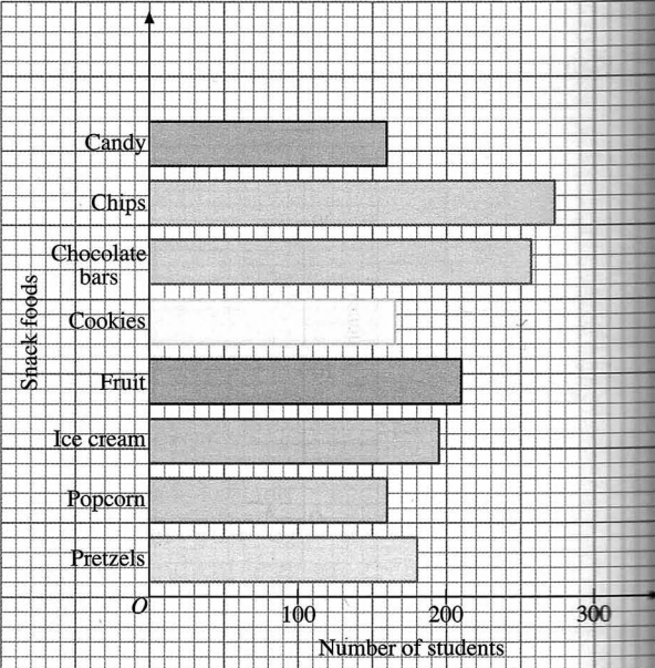
a) Which snack food was most preferred by the students in Mrs. Costa’s school?
The most preferred snack food were chips (270).
b) How many students preferred fruit?
210 students preferred fruit.
c) Which snack food were preferred equally by the students?
Popcorn and Candy were preferred equally by the students (160).
d) Name the top three preferred snack food among the students in Mrs. Costa’s school.
- Chips (270)
- Chocolate bars (app. 260)
- Fruit (210)
2. The bar graph shows the numbers of rainy days in Sunshine City over a period of four months.

a) Which month had the least number of rainy days?
May had the least number of rainy days.
b) What is the ratio of the number of rainy days in June to that in August?
Ratio of June to August is 1/2.
c) Find the average number of rainy days in the four months.
The average number of rainy days in the four months is (3+5+8+10)/4=6.5 (app. 7).
3. The following table shows the examination results in mathematics of 7th grade students in a particular school.
| Grade | A | B | C | D | E |
| Number of students | 30 | 46 | 60 | 40 | 24 |
a) Represent the data with a bar graph.
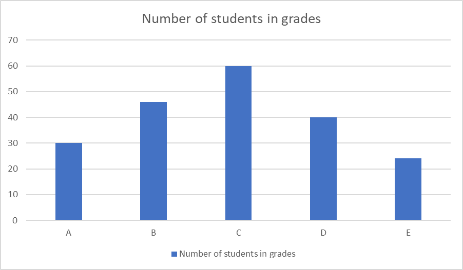
b) Which graph is easier to draw?
Definitely, the bar graph is much easier to draw.
4. The histogram shows the distance between the homes and the school of some students.
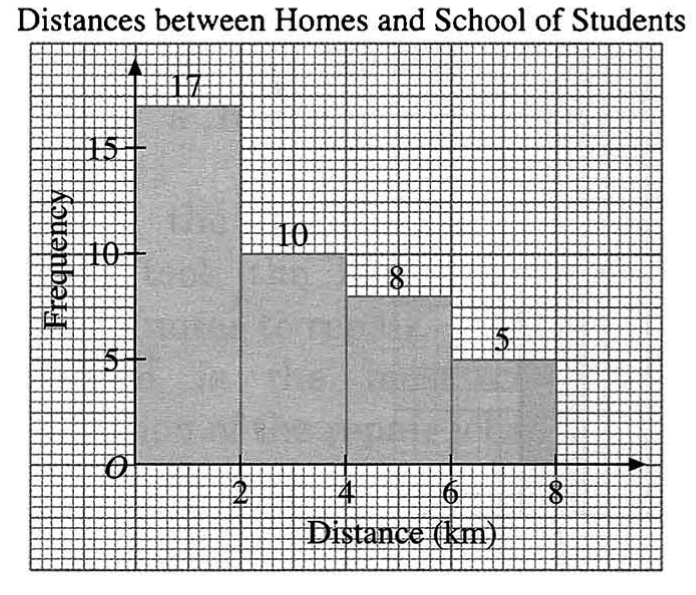
a) What is the class width of each class?
The class width is 2.
b) Find the percentage of students who live more than 6 km from their school.
The percentage of those students who live more than 6 km from their school is 12.5%.
The total: 17+10+8+5=40
40=100%; 5=x%; x=12.5%
c) Describe the shape of the histogram.
The number of those students who live more than 4 km is 13.
Each distance below:
0-2 km — 17 st. (closest)
2-4 km — 10 st.
4-6 km — 8 st.
6-8 km — 5 st. (farest)
The number of students according to their distances is decreasing.
5. The histogram shows the daily wages of some workers in a survey.

a) Find the number of workers whose daily wages are not more than $80.
The number of workers whose daily wages are not more than $80 is (10+15) 25.
b) Describe the distribution of the daily wages of these workers.
$85-90 is the highest (30 workers). The number of those who’s wages are between $80-85 and $90-95 is equal (25 workers).
The number of those who’s wages are between $75-80 and $95-100 is equal (15 workers).
The number of those who’s wages are between $70-75 and $100-105 is equal (10 workers).
The description of the shape: bell or normal.
